Graphing with Origin
It is often difficult to grasp the relationship existing in a set of data from an examination of a table of measured values. A method widely used to discover such relationships is the graphical method, which gives a pictorial view of the results and makes it possible to interpret the data by a quick glance.
In any experimental study of cause and effect the aim is to vary just one parameter at a time (independent variable) and to observe the effect on the corresponding values of another quantity (dependent variable). Usually, the relationship is most easily interpreted if the independent variable is plotted on the abscissa scale (x-axis) and the dependent variable is plotted on the ordinate scale (y-axis). When a graph is described as a plot of A vs. B, it is generally understood that A is the dependent variable and B is the independent variable.
Graphs may be created using the computer program Origin or another graphing program such as Excel. In either case, your graph should have the following properties:
- It should be neat and easy to interpret.
- Each axis should be labeled with variable names, units, and enough numbers to determine the scale used.
- The graph should have a descriptive title, one that does not include the names of the variables being plotted.
- If a function is fitted to the data, the parameters of the fit should be shown on the graph.
If you are using Origin to plot your data, the program will automatically choose a scale for your data. Sometimes for the sake of neatness, or to extrapolate beyond the data, you may need to change the scale. This can be done by right-clicking on the numbers and choosing “Scale”.
After opening the Origin program on the computer, enter the x values in column A and the y values in column B. To automatically label the axes, enter the axis name in the field ‘long name’ for each direction (x, y). Highlight both columns by clicking A(X) and dragging across to B(Y). Plot a scatter graph by choosing Graph, Symbol, and then Scatter.
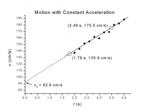
 Along each axis, label the name of the quantity being plotted together with the proper unit (see image). Abbreviate all units in standard form. Origin will label the axes by default “X Axis Title” and “Y Axis Title”. These can be changed by double-clicking on them. Remember that you can name the axes in the data table. The title should be on the body of the graph or above it. The title should tell the reader what is being plotted, and should distinguish this graph from any others in your write-up. In general, the title should not repeat the names of the two quantities being plotted. To add a title in Origin, click on the Text Tool, then click where you want the text to be inserted.
One of the principle advantages of graphical representation is the simplicity with which new information can be obtained directly from the graph by observing its shape and intercepts. Usually the plotted data will readily show a pattern. If it doesn’t you may want to check for errors. This pattern tells you how the dependent variable (y) depends on the independent variable (x).
The shape of the graph immediately tells you whether the dependent variable increases or decreases with an increase in the independent variable. It also indicates something about the rate of change. If the points lie along a straight line, there is a linear relationship between the variables.
Make sure that you have a graph already made in Origin. Fit your data by choosing Analyses, Fitting, and then pick a fit type. The appropriate choice of the fit depends upon what you graph. After you perform a fit, you will want to find the values of each variable with their associated uncertainty and the quality of the fit. Those are found in the display box on the graph after you fit.