HOW TO – Graph and Analyze Data with a Spreadsheet
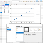
A spreadsheet can be helpful for analyzing trends in data. It is often helpful to see these trends visually using a graph. Most spreadsheet will allow you to insert a graph by selecting the data you want to plot and choosing ‘Chart’ from the ‘Insert’ menu or something similar. You should choose the Scatter Plot or X-Y format for your graph – options such as ‘Bar’ or ‘Line’ graph merely plot the y-values with respect to row number instead of the x-values.
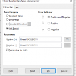
Error bars should be shown on plotted data points. These can usually be added by right-clicking on a data series in the graph and choosing “Insert y error bars” from the context menu. Options for the error bars allow you to specify a single value for all data points, or choose a column containing uncertainty values as shown.
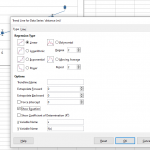
Trends in data, such as the slope, intercept, and/or other parameters can be found by fitting a trend line to data. Right-clicking on a data series and choosing “Insert Trendline” from the context menu brings up a dialog. Checking the “Show Equation on Chart” box allows values such as the slope and intercept to be seen. Important to note is that most spreadsheet programs cannot tell you the uncertainty in the resulting fit parameters as more complex software such as Orgin can.


